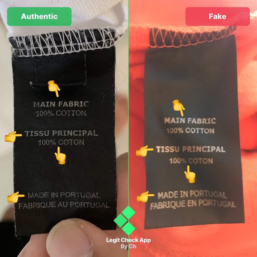
“E” & “T” Spacing: The fake tee has a noticeable gap between the letters “E” and “T”. The authentic tee, however, has them closer together.
First “T”: The bottom of the “T” on the fake is more curvy than on the authentic tee.
“E”: The bottom leg of the letter “E” on the fake is too thin compared to the authentic.
“M”: The fake’s “M” is noticeably thinner than its authentic counterpart.
“N”: The bottom of the “N” on the fake tee is too thin.
Second “T”: The fake’s letter “T” is too thin and curvy compared to the authentic tee’s “T”.


